My Friend’s Dining Room

It’s funny how most of my good friends are not into home decorating and find it incredibly stressful while I love doing it.  So, when my friend asked me for suggestions on how to redo her dining room, I happily agreed.  I told her that I’m no designer though, so I can’t make it a certain style, I can only do it the way I like if it were my dining room.

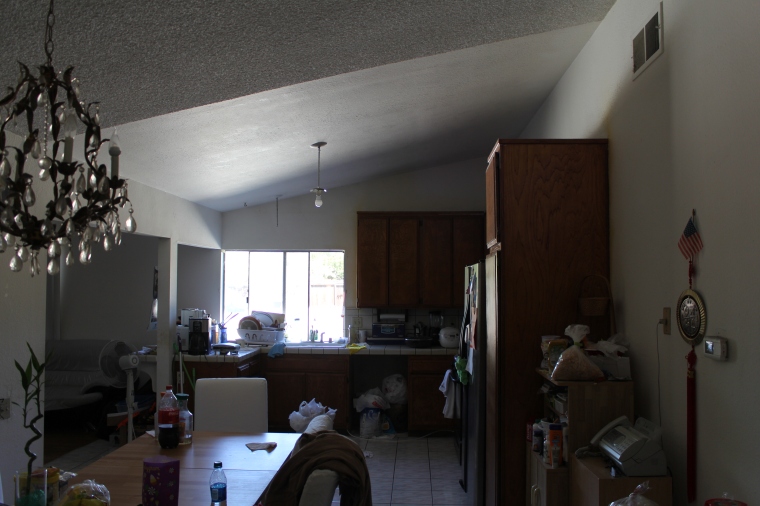
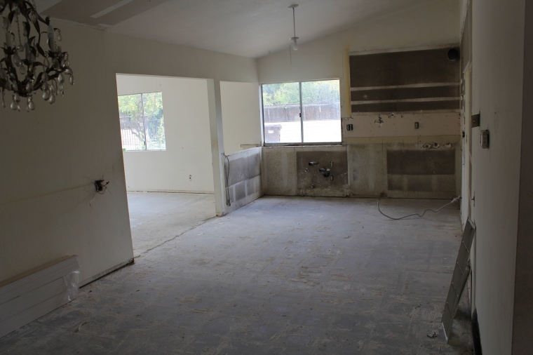
So, below is her dining room.  It’s currently traditional in style and I think a bit dark and serious.  I prefer it to look bright and happy, with nothing too precious as she has 4 kids that she home schools.

img_2917

I scoured pinterest looking for inspiration and have come up with the following thoughts.

First, I would lighten the walls and paint it in a light gray/beige color.  I’ve recently used Behr Ground Fog which was a nice greige but the rooms were very bright whereas this room is not that bright during the day.  A few other options would be Benjamin Moore Gray Owl and Sherwin Williams Aloof Gray (the color  in my living room.)  It would be a good idea to try some swatches to see what works with the lighting in this room.

Next, I would add some white wainscoting like this:

image

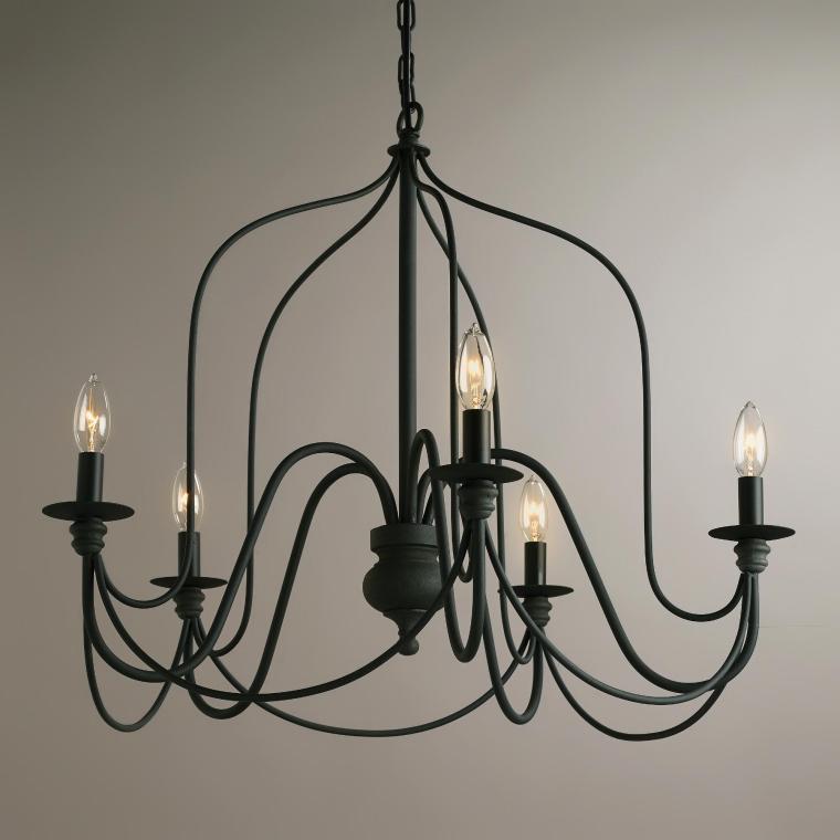
And a new chandelier:

driscoll-9-light-multi-tiered-chandelier-6e5def5b-9160-4326-b08b-e66edba9afee_600

With these Target dining chairs:

16634670

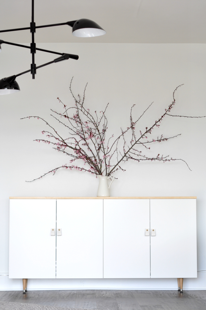
For the buffet, I would DIY one using white IKEA cabinets like House Updated did below but to keep the wood tones more consistent, I would go with a darker wood top and legs to match the legs on the target dining chairs above.  I would probably also use shaker cabinet fronts so that it doesn’t look so modern as compared to the rest of her house.

diy-modern-buffet

Above the buffet my friend wants to put a framed vintage map poster and she wants to keep her dining table.

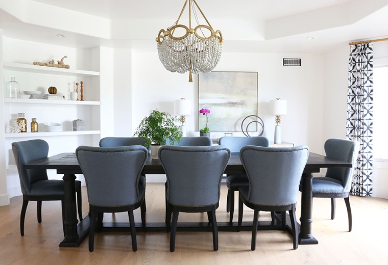
Below is a dining room designed by Studio McGee.  I love their work and though it doesn’t look much like what I put together for the dining room above, it was one of the early pictures I pinned as inspiration.  I think why I gravitated towards this look is because the room overall feels very light and bright even though the dining table and chairs are dark and traditional. I really like the built in shelves and have been staring at my friend’s dining room to figure out how to incorporate built ins.  I think built ins in the entire wall with two windows would look really nice.

studiomcgee3-min

Ok, so there you have it, what I would do with my friend’s dining room.

By the way, I did find a much more affordable chandelier from Cost Plus World Market, but I personally would splurge on the one above because I think it’s so much nicer, gives off more light with 9 bulbs, and is something that I would be willing to spend more on because it’s a more permanent fixture.

40956_XXX_v1.jpg

Let’s see what my friend does with her dining room.  Maybe she’ll have a picture to share when it’s done.


What I Learned from L-House

6G9A1820.jpg

Having a good contractor and real estate agent made a huge difference.  People have asked me if I would get a real estate license and handle that part by myself, or hire subcontractors and act as my own general contractor.  These are both things I considered before I started, but can now say with certainty that I have no desire to do either.  I want to spend as much time as I can with my family and also have a full time job that I enjoy.  I got to do the fun design part, leaving the headache of managing a crew and dealing with the paperwork to my contractor and real estate agent.  Sure, I have to pay for their services, but I think it’s money well spent to have people who know what they are doing handle these aspects, and allow me to do the part I enjoy,  the designing.  This way, it doesn’t feel like “work” to me, but rather, a fun hobby, that hopefully can generate some income.

As I mentioned, E bought L-House over 15 years ago so it had significantly appreciated, even in its original state.  What I wanted to know was whether investing the time and money to renovate would actually appreciate its value beyond what we put in, or perhaps be a wash and just allow it to sell faster.  Worst case scenario, we may even lose some of the money that we spent on renovations.  In the end, I think the renovations allowed it to sell faster and at a much higher price than anticipated.

Construction took about 10 weeks, a bit longer than anticipated due to some delay in waiting for the cabinetry as well as time for the grass to grow in (we didn’t want to spend on turf so we grew from seed).  We had open house on a Saturday and Sunday in early summer and met with the realtor 4 days later to make a decision on the 9 bids that we received, many of which were over the asking price.  We decided to counter the 6 or 7 bids that were at or above asking price, requesting them to give their best and final offer, agree to work towards a 17 day escrow and find alternate funding if the lender appraisal came out lower than their bid.  3 days later, we had a signed offer with the highest bidder.

Now, I learned that choosing a buyer wasn’t as simple as choosing the highest bid, though that’s eventually what we went with.  More importantly, we were trying to choose the buyer with the highest chance of making it through escrow smoothly.  They needed to have a good amount of money in the bank, and verified funding, as well as be very motivated to buy and move quickly.  Our agent helped us assess this, based on her discussions with the buyers, buyer’s agent, and from her experience.

Despite the smooth and fast process in getting bids, the escrow part did drag out much longer than expected, out to about 45 days.  This was mainly due to the fact that the assessed value came out quite a bit lower than the bid.  Our realtor indicated that institutional lenders’ appraisals do typically come out lower than private mortgage lenders’ appraisals, but it’s not like choosing a buyer using a private mortgage lender would guarantee no issues.  The key is identifying a motivated buyer who is equally eager to move the process forward to get into the house as soon as possible.  Though we had asked buyer to agree on coming up with the funding if the appraisal came out lower, in the end, we had to come down a bit on our price and the two agents took a  cut in their commission to move things forward faster.

Overall, the final price was still a good amount over the asking price.  The renovation also made a huge difference, allowing it sell very quickly, as well as generating conservatively, a 50% return on investment and potentially even over 80% (based on the real estate agent’s original assessment on how much the house would sell “as is”).

We are really happy and thankful of the outcome.  What I didn’t anticipate was the high amount of capital gains tax associated (~30%) of which there is no tax shelter or opportunity to increase charitable giving to offset.  However, I am still very thankful.  This was a fun experience and I’m already asking my agent to send me more homes to review.  Ready for the next project!


L-House Bedrooms and Baths

The left side of the dining room opens up into the hallway that leads down to 4 bedrooms: three small ones to the left with a bathroom to the right, and the last door to the right leads down to the master bedroom.

Hallway

The three bedrooms were essentially identical square-ish rooms with a good sized window and small closet.

Bedroom

All we did in here was to scrape off the popcorn ceilings, new paint, molding, floors, light, door, and window.  So basically, everything new but was an inexpensive fix since we didn’t change anything structurally.  The closet doors got a fresh coat of white paint.  The trim around the closet was a dated gold color, but the contractor spray painted it white, which I thought was a great idea.  Wall color is Behr Ground Fog.

6G9A3753

The hallway bath is small and very dark with no windows, so I wanted everything to be lightened up in here and the vanity size reduced.

Hallway Bathroom

We installed a white subway tile and painted the bathroom Behr Subtle Touch.  Originally, I wanted to go with a pedestal sink, to make the bathroom seem more spacious, but my contractor convinced me to go with this small vanity, which had about the same footprint as a pedestal sink, but would allow the owners some space for storage.  If it were me, I still would have gone with a pedestal sink, but it made sense to me that people would want storage in their bathrooms.  The vanity mirror is from Home Goods.  To the right of the vanity, there is a mirrored recessed medicine cabinet for added storage.  The flooring which you can’t really see from the photos is the same gray tile that is in the kitchen/entry way.  One thing my real estate agent pointed out is to move the shampoo holder from under the shower head, to the opposite end.  Just a tip to keep shampoo bottles cleaner and out of the water.  By the time she saw this, the contractor already installed it and I did not think to give him any instructions on where to put the soap and shampoo holders.

6G9A3749

The master bedroom entry way was originally a set of double doors.  For such a small room, it didn’t make sense to have double doors, and also made furniture placement more difficult.

Master Bedroom

We dry walled a section and had it changed to a single door, which I thought made a big improvement to the functionality and aesthetics of the room.  A darker gray was used for the master bedroom, Behr Dolphin Fin, as I wanted a bit more contrast with the molding here, and wanted it to feel warmer and cozier.  In the pictures, it looks the same as the other bedrooms, but in person, the color looked a bit richer.  The double sliding doors leads to out the same pergola as the adjoining family room.  Again, we kept the closet doors and spray painted the trim white.  The room is not big, but is nice and cozy and can fit a king sized bed.

6G9A3756

The old master bath was  tiny, with only a narrow shower and toilet enclosed, and the single vanity and closet open to the the rest of the room.

Master Bathroom

Here, I enclosed the vanity into the bathroom and was able to fit double sinks, a wide shower, and a linen closet into this space.  This is much better sized master bath and is in line with scale of the rest of the house.  My contractor found this white vanity with a marble top as I really wanted to incorporate some marble in the bathroom.  The vanity lights are from Joss and Main and are really well priced.  I’d like to use the black ones for another project as black seems to be very on trend right now, and I actually really like it.  The nobs and pulls are the same ones we used in the kitchen.  The mirrors I picked up at Home Goods and was lucky to find two matching mirrors.  I  think they make the bathroom look higher end with the matte gold trim and feel pretty substantial.

6G9A3757

On the shower side, we incorporated some marble trim on the edges and on the seat and recessed nook (on the wall opposite the shower head).  I really liked the simple white and gray basket weave tile from Home Depot we put on the shower floor as it was nice, and affordable.  The contractor also found a decent looking shower frame within budget, though I would have opted for frame-less.  However, this framed one really didn’t look too bad.  To the left of the shower door, we were able to fit in a linen closet with the same shaker style cabinet doors as the kitchen.

unnamed

Overall, I loved how the master suite turned out.  I keep thinking how wonderful it would be to downsize and not worry about a mortgage.  With the trend of “tiny homes” this 1585 sq ft house really is plenty of space for a 4-person family.  As I continue purging “Marie Kondo” style, I think we would be able to fit comfortably in a much smaller home.  I’m crazy for even thinking this with all of the effort and construction that has gone into our current home.  But I’m finding that I don’t mind starting new, throwing things out, and moving.  I never was very sentimentally attached to things.  We’ll see…. But as for this house, I really hope the new family enjoys this space.

L-House Kitchen, Dining, and Family Room

Here is a before picture of the kitchen.  It was original to the house with tiled flooring, countertops and blacksplash.  The kitchen, dining, and family rooms are connected for a nice big space for entertaining and spending time together as a family.

Kitchen

We tore everything out in the family room and kitchen to start with a clean slate.  That post below is holding up part of the house so unfortunately, we could not remove it as it would cost too much.  I had an idea to wrap it with reclaimed wood, but then decided to keep things simple and just painted it.  Plus, I wasn’t sure of how people felt about reclaimed wood and if it’s just a trend now that will date the house in a few years.

Family Room

Both rooms get a fair amount of natural light so I knew they would look pretty nice once we swapped out everything.

Kitchen

Here is the brand new kitchen!  Our contractor ordered white shaker style cabinets from Home Depot and put in this large farmhouse apron sink from IKEA.  I love farmhouse sinks and can’t wait to get one in my own house.  The simple pendant light above the sink is from Lowes.  We used the same gray tile throughout the entry way, dining room, and kitchen (and again, please excuse the construction dust on the floor).  I chose a dark gray granite countertop to match the flooring.  Originally, I was trying to find a granite that resembled marble but it was over budget, and in the end, I liked having the countertops match the floor and how it breaks up all the white on the cabinets and subway tile backsplash.  The nobs and pulls are from amazon and looked quite nice for the price.  I wished I had told my contractor beforehand that I wanted the pulls in the center of the drawers rather than at the top.  Small details…

The window looks out into the pool area so I had the granite built to extend outside the window for a small bartop outside for ease of passing food and drinks.

6G9A3743

See the counter area below?  That is my coffee bar.  I’ve been wanting to create a coffee bar ever since we went to this restaurant, SQRL, in LA where we sat at the counter for breakfast.   (The breakfast is great by the way!)   If it were my house, I would have put in a chalk board paint area but kept it neutral for this house.  I imagined putting 3 bar stools here with a nice espresso machine, soda stream, and some open shelving up top for displaying cups and glasses.  This was one of those things which was probably unnecessary from a resale perspective, but just something I wanted to do.  The chandelier is from pottery barn and was surprisingly affordable.  I saw it at a friend’s house and really liked the black color and how simple it looks.

If I were living here, I would put in some built in around the dining area to make more efficient use of the space and give it some character.

6G9A3739

Lastly is the family room.  We repainted the family room, kitchen, dining room, and entry way in Behr Subtle Touch, which is a light gray color with some tint of blue undertones.  The flooring is the same medium toned wood that was used in the living room.  The sliding doors open into a concrete area in the back yard which is great for entertaining.  We added a white pergola attached to the house, which helped define an outdoor dining space.  To the right is a view of the swimming pool.  This is a very bright and happy space for the family to gather.

6G9A3745

I designed the house to suite a young family like ours and it turned out that all of the bids we got were from young families.  But more on that later…

L-House Living Room and Entry Way

The living room was a dark, over cramped room to the left of the front entrance if you were walking in through the front door.  I don’t have any before pictures but here are a few “in progress” pictures.  Below you can see the front entrance and how it opens up into the living room.

Living Room 2

Removing the trees in the front made a huge difference in the lighting of this room. Because of that, I was able to use a slightly darker paint color (Behr Ground Fog) and still have it feel light and airy, without feeling cold, which is what my real estate agent advised.  I mostly stayed away from the colder grays, and tried out “greige” colors, to keep with my love of gray, but still allow the house to feel warm and cozy.

Fireplace


I wanted to make the fireplace the focal point in the living room.  Inspired by the fireplaces designed by Joanna Gaines (HVTV’s Fixer Upper) and her love of shiplap, I came up with this.

6G9A3735

I asked the contractors to build a traditional mantel above which they installed horizontal planks, inspired by shiplap (seen better in the picture below), and tiled over the brick with marble tiles.  At the base, they built a ledge that is covered with a slate gray tile that also used in the hallway, kitchen, and bathrooms.  In addition, we added new trim and crown molding, recessed lighting and laminate wood floors.  Speaking of the laminate wood, our realtor advised that since the look of laminate has improved so much, buyers are ok with it and this was an area where we saved while still achieving the look of hard wood floors.  On the other hand, I debated over the fireplace because having a custom built mantel turned out to be quite expensive.  I could have just painted the brick white and called it a day but I was so excited about the design I came up with that I just had to go through with it despite the cost.  E encouraged me to go with it to test out my design skills, knowing that we couldn’t lose money on this resell (house bought more than 15 years ago with significant appreciation).  In the end I’m so glad I did.  Our real estate agent heard buyer comments that they liked the fire place and it just makes me feel good to make the room what I wanted it to be.  I’m curious to hear any thoughts on the fireplace and if it was a worthwhile splurge.

6G9A3737

The front door change made a huge difference to the entry way, making it bright and inviting.  I always thought that having solid, double doors for this small house did not look right.

Front Door

I would have liked simpler glass panes but conceded to this front door from Home Depot due to cost and immediate availability.  At least the design on the glass was simple and not flowery.  I added wainscoting to enhance the cottage feel and also to add more white to the space and allowing some contrast with the walls, which are painted Behr Subtle Touch, which is a light gray/blue color.  Here is where it is important to check on the house regularly (more than weekly, or every other week, which is all I had time for with a full time job and 2 kids).  I wanted a wide panel wainscoting but what got installed was very thin vertical planks.  I am still bummed about it looking at this picture, put overall, it probably (hopefully) did not make too much difference.

6G9A3739

Disregard the dust on the floors.  These pictures were taken before the house was cleaned and there was a lot of construction dust.  Otherwise, I liked the look over the darker tiled floors against all of the white and light paint colors in the house.  The tile I linked to is a lighter gray but in-store, they have the darker, charcoal gray color which is what I used.   Also, I felt the dark floors were ok with the ample natural light in the house.  The schoolhouse ceiling light is from lamps plus though I can’t find the original one I bought which was about $50.  I really like this type of light and have one in my house as well, though from Restoration Hardware.  It’s classic and simple.

I can imagine a bench in front of the wall to the right with hooks installed in the wainscoting for hats and small backpacks/bags.  I really like how the living room and entry turned out and the house overall.  I kept telling E that I wanted to move in!

L-House Exterior

My friend’s husband gifted her with a new hobby.  He and their kids made raised garden beds filled with organic soil for her to fill up with whatever she wanted to plant.  I thought that was such a great idea for a present and “hinted” at E to come up with something similar for my birthday.

And boy did he deliver.  Since we bought our home 8 years ago, I’ve really enjoyed the home renovation process and have always wanted to try my hand at renovating and selling a house.  I wondered if anyone would like my aesthetic and be willing to buy a place that I “designed.”  E gave me the L-House, the first house he bought out of college for  his family to live in which has been rented out for the last 8 years, to renovate and sell.   This dear old house has been a workhorse for us, generating rental income and providing a pool of equity for us to dig into when needed to buy and renovate our current home. Throughout the years, it’s gone through quite a bit of wear and tear and was in pretty bad shape.  Being that this home was bought over 15 years ago, it’s appreciated quite a bit and I knew I couldn’t lose money on it.  What I wanted to see is whether my renovations on the home would increase its value beyond the renovation costs and also allow for a quicker sale.  We’ll get into those details in a future post but first, below is our Lincoln House.

Front_removed number

It’s a ~1600 sq ft tract home on a ~10,000 sq ft lot with a pool.  The front double doors were painted a red “lucky” color and the the bushes/trees in front of the window were quite overgrown. The eaves were rotting and the roof shingles were old and coming off.

Now take a look at the new house.  Can you tell what we did?

6G9A1823

  • New roof – gray shingles
  • All new windows
  • Removed all of the overgrown bushes/trees in the front to show the large picture window in the living room and brighten the space.
  • New front door with one canned light above the entry – the house seemed too small to have a double door. Instead, we added a front door with two side panels to let in more light.
  • New garage door with added sconces on each side.
  • E must take credit for this but he came up with the idea of tearing out the old fencing and building the horizontal planked fencing which we stained a coffee color which I think gives the house a clean, more modern look.
  • Repainted the exterior stucco with Behr Marquis paint in Park Avenue with the trim painted white.  The bar above the garage and below the front window was painted a darker gray/beige color which I thought looked much better as an accent than painting it white.
  • Repaved the asphalt driveway with concrete and widened it to line up with the side fence doors.  Squared off the front path with pebbles to make it look cleaner and give some interest.  After this picture was taken, the grass had grown in greener and we also planted some bushes (that will not grow more than 3ft tall) in front of the porch.
  • We also put in a new simple black mailbox that is not pictured.


What do you think?  I was originally considering a much darker paint (like a dark gray) for a more modern look but felt it contrasted too much with the other homes in the area.  I ended up really liking this lighter look.  I feel it looks clean and non offensive, which was what I was trying to go for in general.  Since the house is relatively small, I wanted to give it a modern, “cottage-y” feel.

A few other things we considered, but did not make economic sense:

  • Adding hardy plank paneling to the front.
  • Pulling out the foyer to line it up with the left wall (you may not be able to tell that the front door is recessed.
  • Adding some design to the concrete driveway by building concrete molds and adding accent rocks in between (a more modern look).